Vending Machine Touchscreen Interfaces: How Touch UI Drives Conversion And Cashless Payment
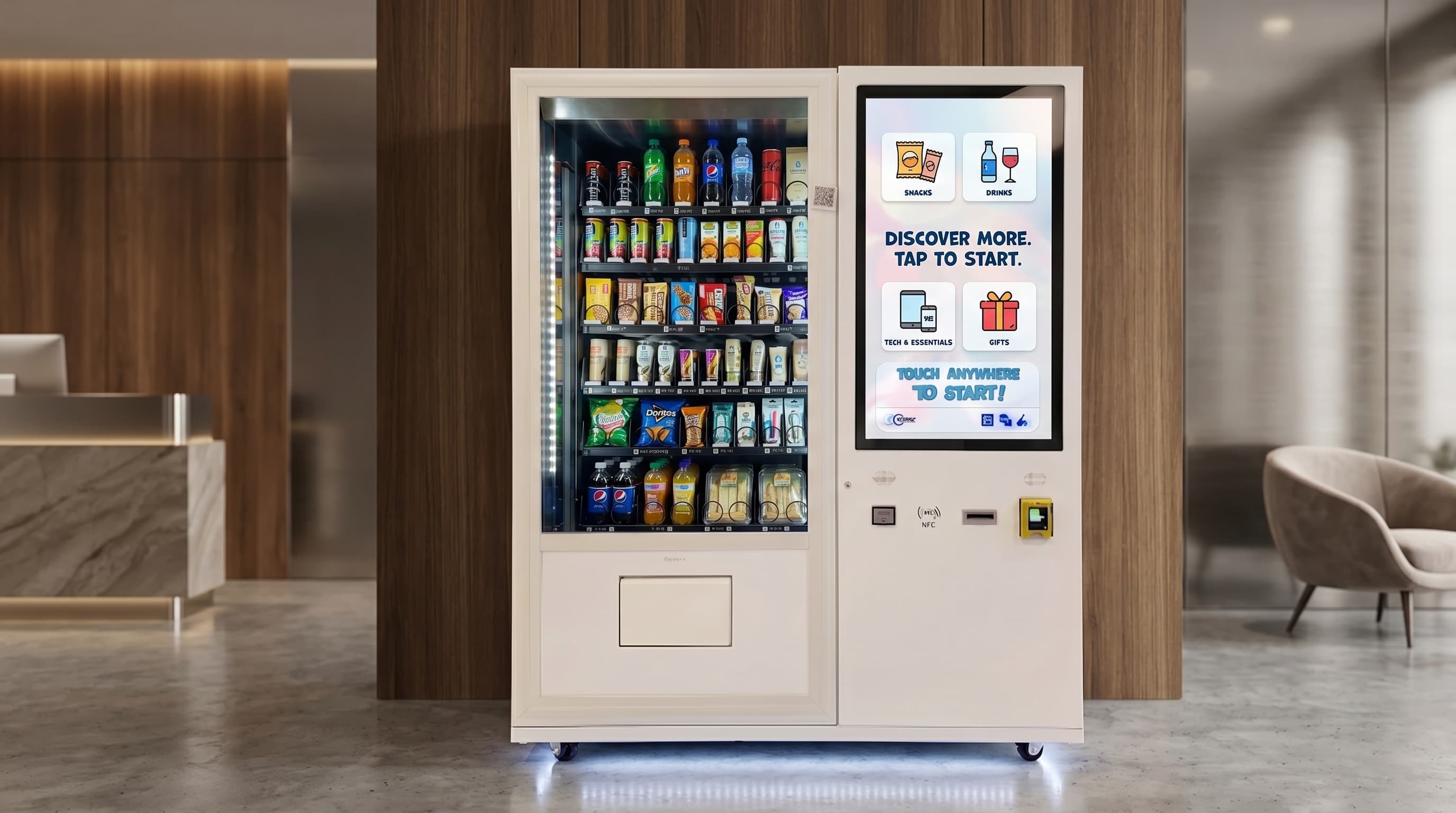
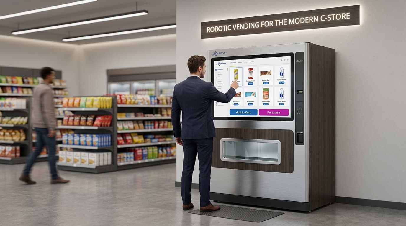
A vending machine touchscreen interface is the front-of-cabinet UI that lets a buyer browse a planogram, view SKU detail, complete cashless payment, and confirm a dispense without operating a mechanical keypad. Modern touch UIs run on hardened capacitive displays mounted at eye level, integrate into the cabinet's dispense logic, and surface pricing, nutrition, allergen, or upsell content alongside the product image. The touchscreen is not cosmetic. It is the part of the machine where conversion rate and SKU velocity are won or lost on every visit.
The URL may be a bit silly, but the commercial subject is not. Operators ranking for queries like vending machine touch screen interface need an operator-grade explanation of how touch UI changes payment flow, merchandising, and buyer behavior compared with old keypad machines.
How a touchscreen vending machine actually works
A touchscreen vending machine pairs a graphical UI with the same dispense hardware a buyer would find behind a keypad cabinet. The display becomes the input layer. The buyer taps a product tile, the machine calls the planogram lookup, the slot is reserved, the cashless payment platform authorizes the card or wallet, and the dispense controller releases the SKU. After the cycle, the transaction can be recorded through DEX audit reporting and the controller layer can feed status back over MDB/ICP or adjacent control logic.
The screen also handles the moments where old machines felt clumsy: sold-out notices, fault messages, promotional tiles, product photos, combo prompts, and on-screen receipts or loyalty offers. A dead keypad just says nothing. A competent touchscreen interface keeps the buyer in a guided flow.
Why a touchscreen UI converts better than a keypad
Touch UI removes friction at the exact points where buyers hesitate. Instead of guessing what B7 means, the buyer sees a real product image. Instead of squinting at a faded printed strip, the buyer sees price, pack size, and stock state on screen. Instead of hunting for change, the payment path is already built around contactless cards, mobile wallets, or app-linked payment. The user journey feels closer to a retail kiosk than a mechanical snack box.
For operators, that matters because merchandising becomes dynamic. Bundle prompts, daypart promotions, loyalty nudges, age-gate warnings, and digital signage all live on the same surface the buyer already has to use. A better UI usually means better average ticket and cleaner cross-sell, especially in premium or branded environments.
What a credible vending touchscreen interface needs
A credible vending touchscreen interface needs more than a pretty screen. It should deliver fast response time under field conditions, large enough tap targets to reduce mis-taps, contrast that works in bright environments, a clear accessibility path, fault-state messaging that does not strand the buyer, and reliable integration back into the operator's payment, telemetry, and planogram stack.
If the UI does not feed useful data back into route decisions, planogram updates, or promotional control, it is decorative rather than productive. Operators buying touchscreen hardware should care less about animations and more about response speed, payment recovery, upsell logic, and what the audit trail looks like after the sale.
Where touchscreen vending machines justify their cost
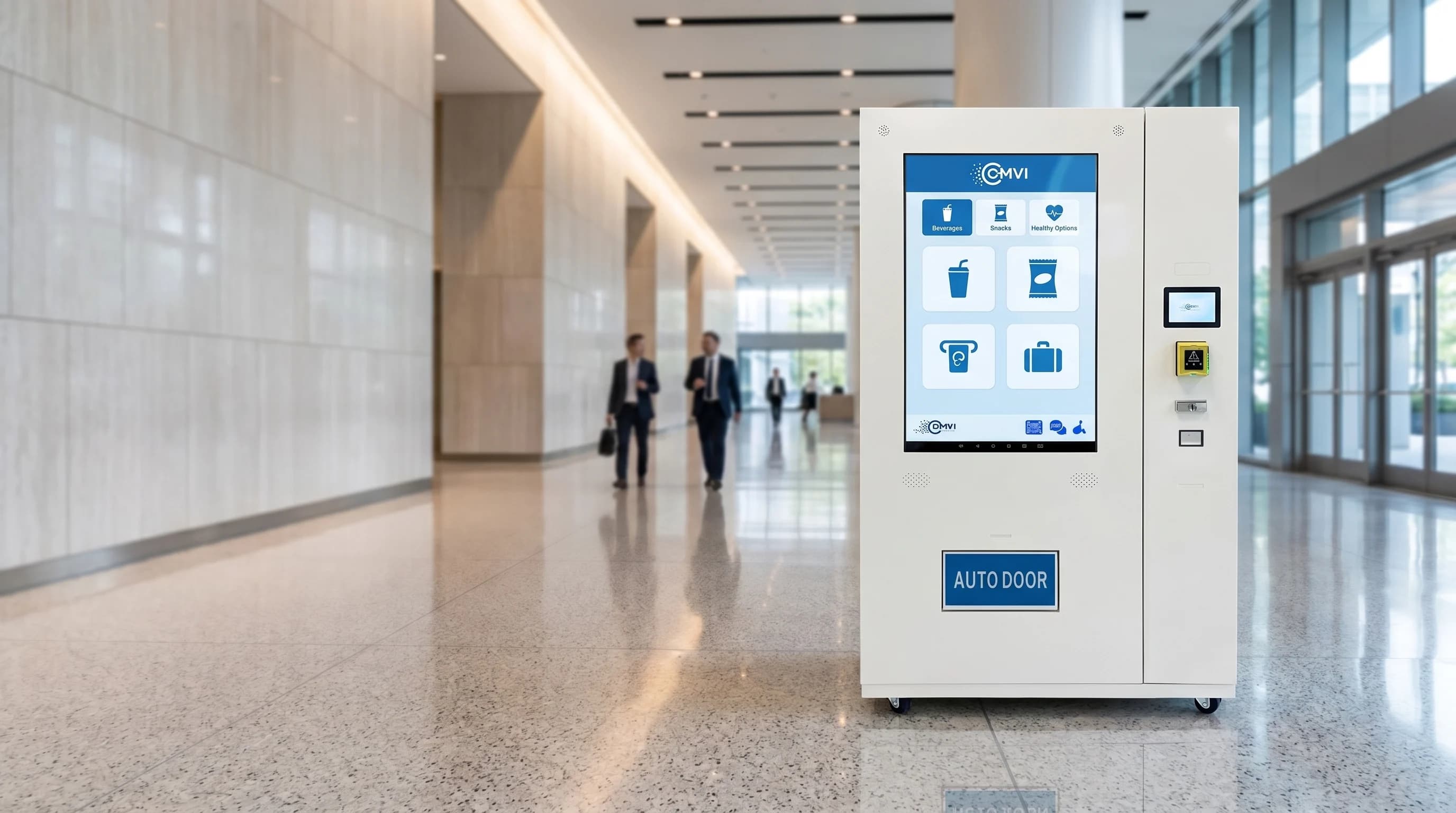
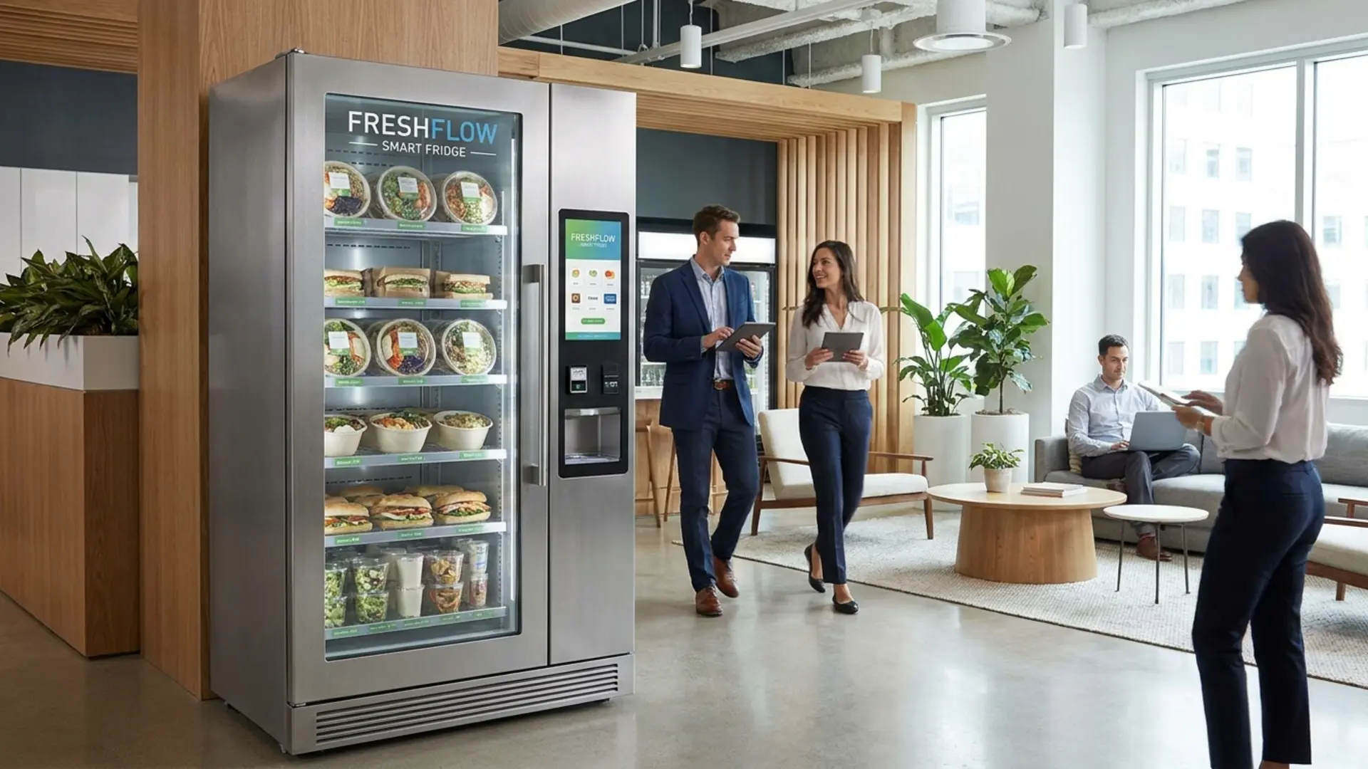
Touchscreen vending machines justify their premium most clearly in locations where presentation, cashless throughput, and merchandising flexibility matter more than the absolute cheapest cabinet. Good fits include corporate offices, gyms, hotels, healthcare lobbies, university campuses, premium retail concessions, and transit locations where the operator wants to control brand presentation and guide product choice actively.
Low-throughput back-corridor placements usually do not need the upgrade. But if the location depends on brand experience, product education, or age-gated workflows, the touchscreen stops being a luxury and starts acting like part of the commercial engine.
Questions buyers should answer before specifying a touchscreen machine
- Does the site need simple snack-and-drink selection, or richer product education and merchandising on screen?
- Will the machine run only cashless payment, or does it still need cash acceptance alongside the touchscreen flow?
- Are there age-restricted or allergen-sensitive SKUs that need verification or warning prompts?
- Does the operator want promotional control by time of day, loyalty prompts, or bundle logic?
- How important are telemetry, audit exports, and remote planogram updates to the route model?
- Is the environment premium enough for the touch UI to improve conversion or brand presentation materially?
Those answers shape whether the correct solution is a compact smart cabinet, a branded wall-mounted vending machine, a full-height M-series machine, or a different self-service format altogether.
Choosing the right touchscreen vending format?
DMVI helps operators scope touchscreen vending around payment flow, merchandising goals, age-gate requirements, and cabinet format so the interface earns its keep instead of just looking modern.